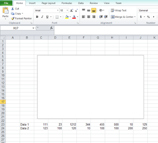
STEP 1 : Click on ‘Insert’
button on the ribbon menu >
choose ‘Line’ >
and choose the style you desired.
Yes, it will appear a blank box as in the picture below. Don’t
panic, we didn't tally it with the data yet.
The chart will appear after we set up the data to it. J
STEP 2 : Create a list of data
that required to display on the chart; Data 1 and Data 2 as an example.

STEP 3 : Right click on the ‘blank box’ > choose ‘Select Data…’

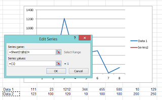
The box as in the image below
will appear.
STEP 4 : Please click on ‘Add’
to tie the data to the chart that we have.

Series Values : Set of data for Data 1 ( Click on button, and click on the cell which written as
‘111’, drag it until the cell which written as ‘129’)
 button, and click on the cell which written as
‘111’, drag it until the cell which written as ‘129’)
Kindly refer to the image
below for further clarification.

Repeat the STEP 4 for the second data.
STEP 5 : Click on OK button and your graph is there. J


